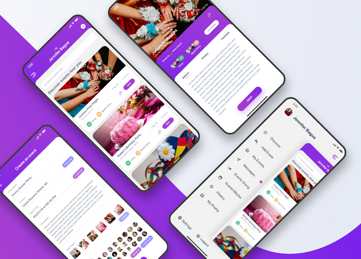
"Vamos de fiesta" is small app aimed to create & manage events on the go. Nowadays there are many events near us & inviting friends & family analog way is boring & time-consuming. "Vamos de fiesta" lets you discover events near you, RSVP on the event with an exact amount of people & kids attending. On the other hand, if you have an event, you can simply just create the event & invite people from your contacts within a few clicks.
Everyone needs to plan events & invite guests anytime. On the traditional way its too much time consuming to invite guests. Sharing some important info, photos, facilities for guest on the event is another hassle. I have to solve those problems in a user-friendly & convenient manner.
- Easy creation of events & inviting guests
- Events discovery with a location
- Search an event based on name or location
- User-friendly and dynamic Event Information including Schedule, Location Map, Photos, Guest count, RSVP
- Ability to chat with event host for discussion/clarification
- Ability to dynamically RSVP on the event with the number of guests including kids attending the event
Men & Women aged between 16 to 35
iOS, Android
Other Event manager applications
4 Weeks
- Research
- Synthesizing research & competitor analysis
- Paper prototyping
- Visual Design
- User Testing & conclusion
By this point, I knew what the problem was, who we were designing for & what are the goals. It was now time for the cool part: coming up with ideas to solve the problem. People aged between 16 to 35 often attends a lot of events & they are the most cheerful. To go more in-depth, I tried to analyze some of the most used apps by this age ranged people. I embraced the idea that event creation & invitation in less click possible is the core concept/mission of this app.
I synthesized the data I gathered from the study about the audiences & apps usage by this age range. I found out what features will be most useful for them & how I can add extra values to this app. I get to know that, most people would be thrilled to know about these features in an app. A very easy to use features will also encourage them to use the app. They just do not want to see a cluttered list of events. A clean event with photos, with details, with total guests attending, will make it more useful. So, bothering them with lots of unnecessary features will be a mistake.
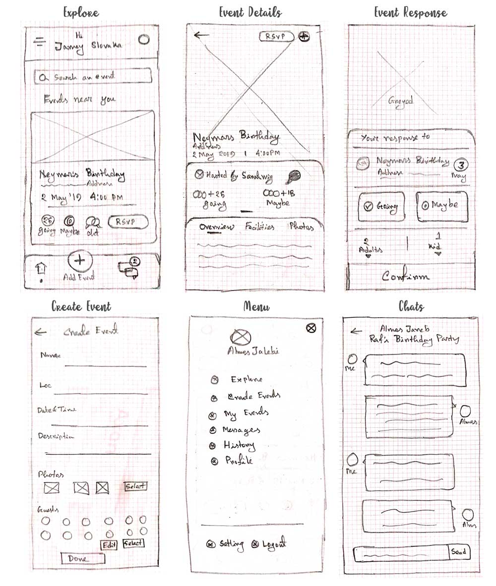
I always prefer to start with brainstorm ideas using pen and paper, as one of the easier and most effective ways. It is the cheapest method to test a digital product and it's very easy to iterate any number of times. I started by sketching as many different ideas as I can think of, some of which can be seen below. Once there are a bunch of them, I analyzed them in more detail and pull out the key idea.
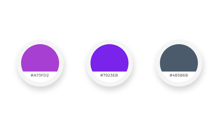
The main motivation for the application was to encourage its users to use the features. On the research phase I came to know about most triggering colors & selected some colors. On the primary digital design, I tested all of them & finally selected these three colors, which are more appealing and pleasing at the same time.
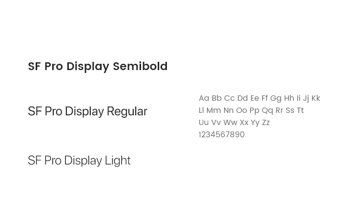
I used SF Pro Display font family mainly. This is one of the most elegant fonts that go with this application type. Typography consistency also exists all over the design.
By this time I know what the basic functions would be on the screens. After the paper prototype, it is time to go digital & get a more clear vision about the UI. I took the concepts I were most excited about in the paper drawing and converted them into digital to have a wider look at them.
From all the feedback & Synthesizing its time for the high fidelity design. A high fidelity prototype is basically a simulate of the final product. I created the static screens using Adobe XD and used it for a more realistic and intuitive transition and scroll too, it a great for making functional interactive prototypes which allows us to better represent the key interactions.
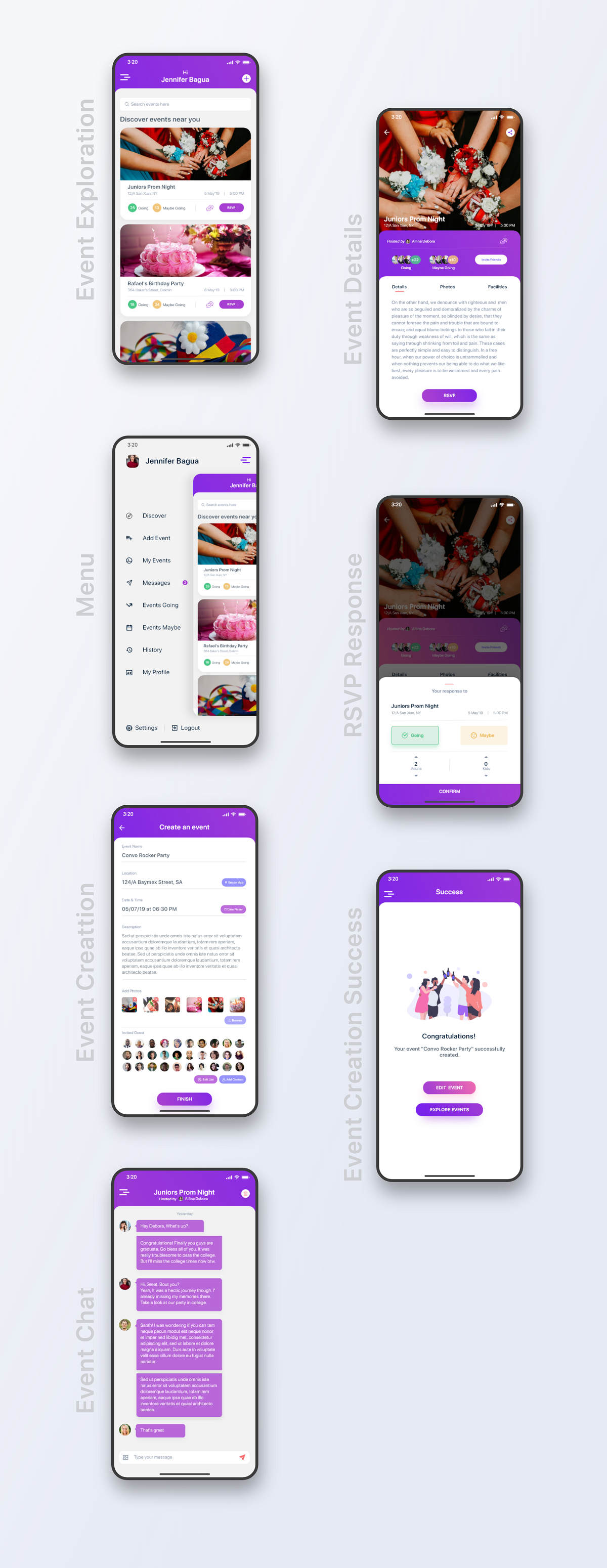
Testing is the part to validate whether the design concepts work or not. I was pretty short on time, but I managed to guerrilla-test the prototype on five people. I put together a test scenario, similar to the example scenario mentioned above, and observed people they are interacting with the app. I found that people liked the way to create events & inviting guests. And they are happy about, how the app enables them to rsvp on any event.
If you have a story to tell or would like to hear some of mine, you can send me a message from the button below.