iMenu is small app aimed to solve some simple problems in the food industry. It is often boring & time-consuming to check food menus from nearby cafe's & restaurants from their respective websites. iMenu aimed to bring all of them together & encourage a food lover to order their favorite food easily. This app will allow the users to purchase foods from physical stores and food trucks located nearby.
Nowadays, different Cafe & Restaurants have different websites. Searching through websites for favorite food is such a hassle. The client wanted to make the app usabilities in fewer click as possible where all the basic user requirements fit in one screen without much scrolling & fit all types of smartphone design standards.
- Allow a user to search through restaurents & cafes by location
- Feature the best foods available in restaurants
- Display the details of each restaurant & cafes clearly
- Display reviews & ratings of customers
- Ability to call or chat with the restaurant's manager
- Organize foods available in specific restaurants with social vote
- Using colors that make feeling hungry
- Overall easy to use navigation throughout the app
Young Men & Women between 20 to 30
iOS, Android
Food ordering applications
3 Weeks
- Research
- Synthesizing research & competitor analysis
- Paper prototyping
- Layout design
- Visual Design
- User Testing & conclusion
By this point, I knew what the problem was, who we were designing for & what are the goals. It was now time for the cool part: coming up with ideas to solve the problem. During our empathy phase, we learned that most of the users are encouraged to buy an item when he/she see some social proof. To go more in-depth, I also learned some techniques about how to drive customers to buy things. I embraced the idea that ordering food in less click possible is the core concept/mission of this app.
I synthesized the data I gathered from the study about the audiences & similar food ordering apps. I found out what they were missing & how I can add extra values to this app. I get to know that, most people just want to order their food in fewer clicks possible. They do not want to see a huge menu(like physical restaurants provide) to order food. They just want to get their most favorite foods. So bothering them with huge menu items will be a mistake. Instead, it will be a good idea just to show some featured/favorite foods in the main merchant page.
I always prefer to start with brainstorm ideas using pen and paper as one of the easier and most effective ways. It is the cheapest method to test a digital product and it's very easy to iterate any number of times. I started by sketching as many different ideas as we would think of, some of which can be seen below. Once there are a bunch of them, I analyzed them in more detail and pull out the key idea.
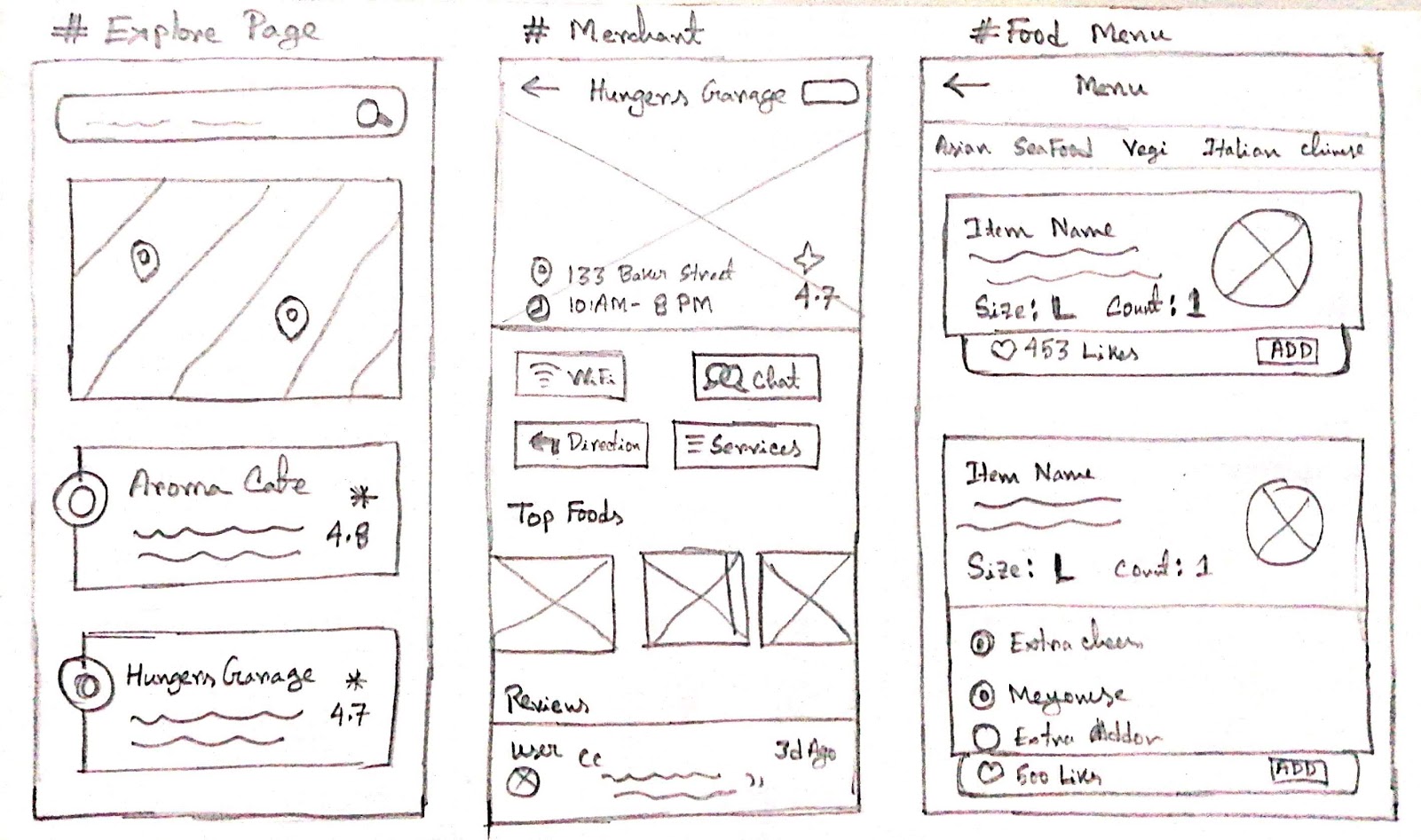
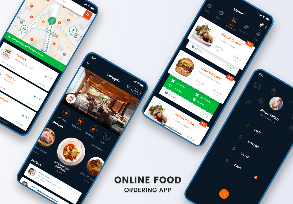
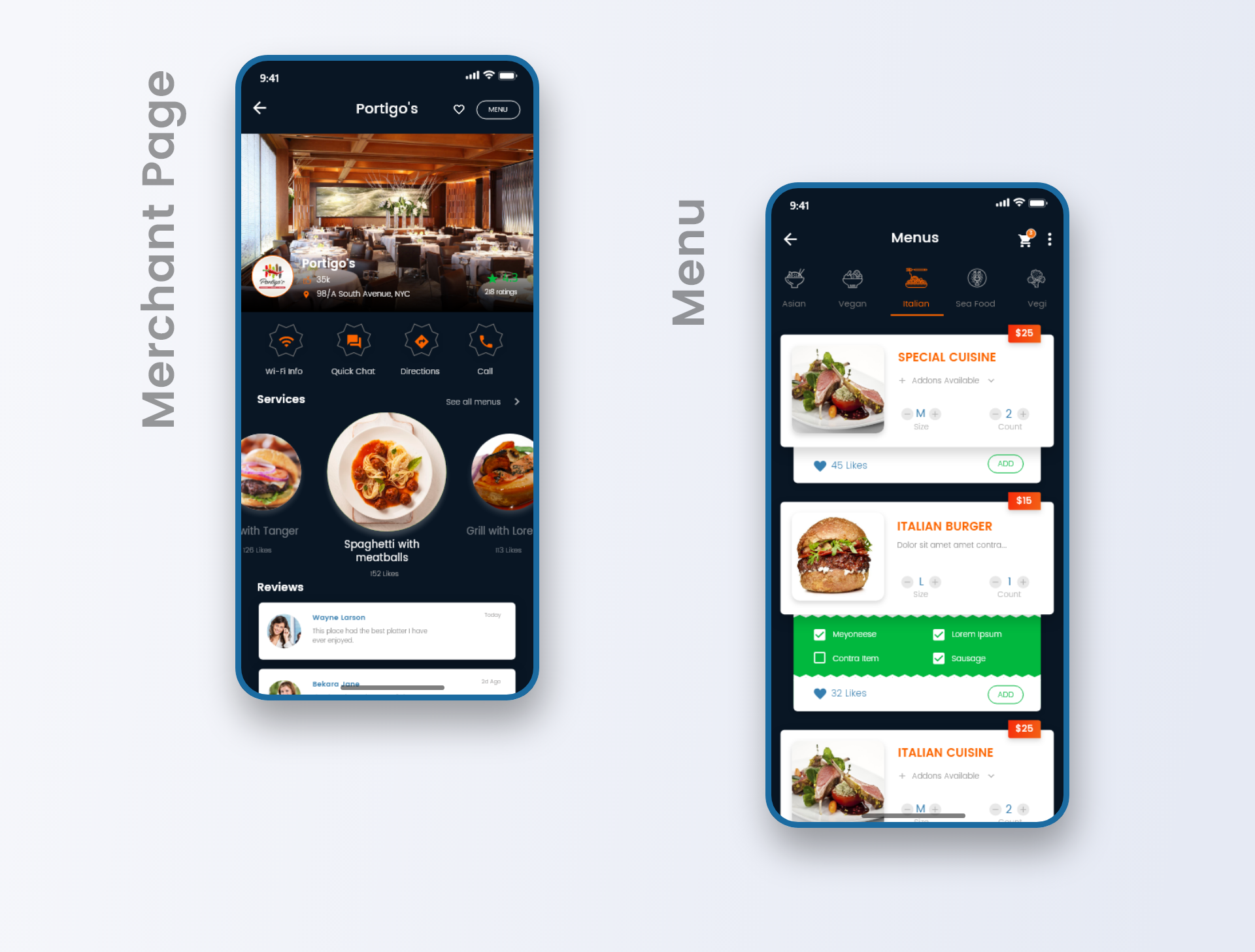
By this time I know what the basic functions would be on the screens. After the paper prototype, it is time to go digital & get a more clear vision about the UI. I took the concepts I were most excited about in the paper drawing and converted them into digital to have a wider look at them. There are three main screens the client emphasized most. They are as:
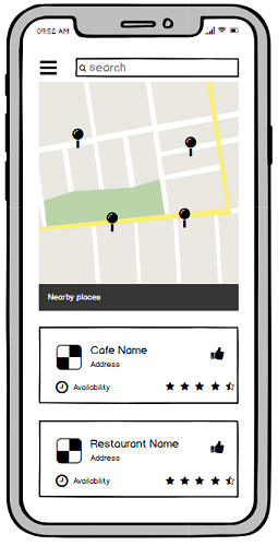
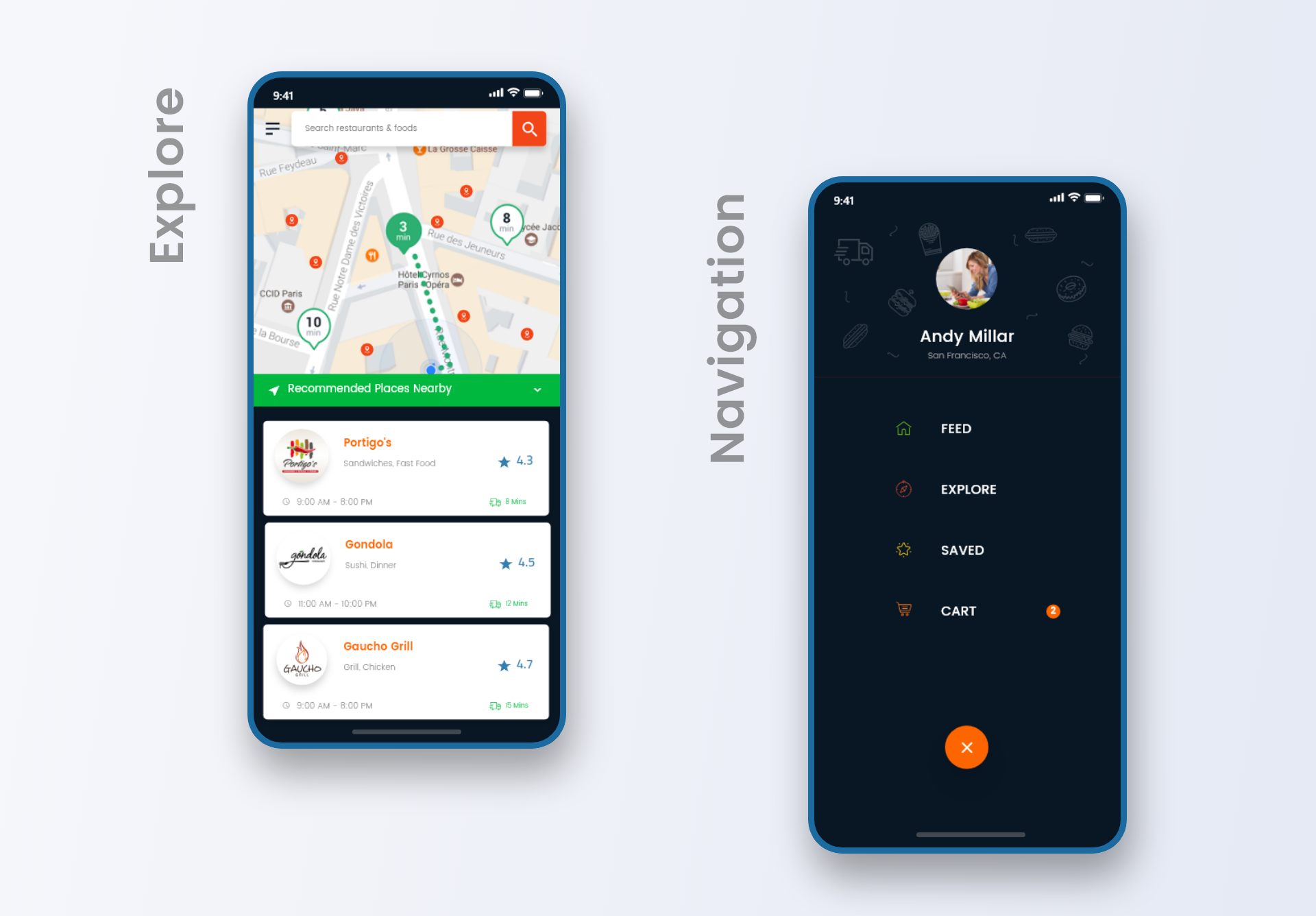
Explore Page
After the user signs up/in he/she would be redirected to this explore page. There would be some recommendations based on his locations. Mostly the recommended cafe's/restaurant's will be based on previous rating & distance from the user.Merchant Page
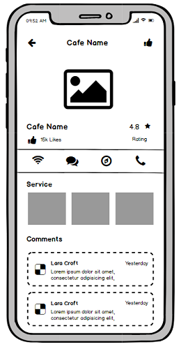
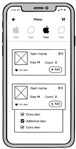
From the recommendations or search results from explore page, when a user clicks on specific merchant page the user can see the cafe shop's most popular foods and rating etc and start ordering.Merchant Menu List
Where users can browse through the cafe shop menu to order. If the user wants some add-ons with food, he/she can also do it by single tap & selecting radio styled buttons.
From all the feedback & Synthesizing its time for the high fidelity prototype design. A high fidelity prototype is basically a simulate of the final product. Prototypes are great because they are cheap and quick ways of testing whether your idea will actually work, before investing times and developer resource into building it. I created the static screens using Adobe XD and used it for a more realistic and intuitive transition and scroll too, it a great for making functional interactive prototypes which allows us to better represent the key interactions.
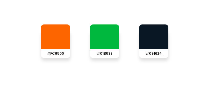
The main motivation for the application was to appeal user to order food & make them feel hungry. I researched through the food industry & selected some colors. On the primary digital design, I tested all of them & finally selected these three colors, which are more appealing and pleasing at the same time.
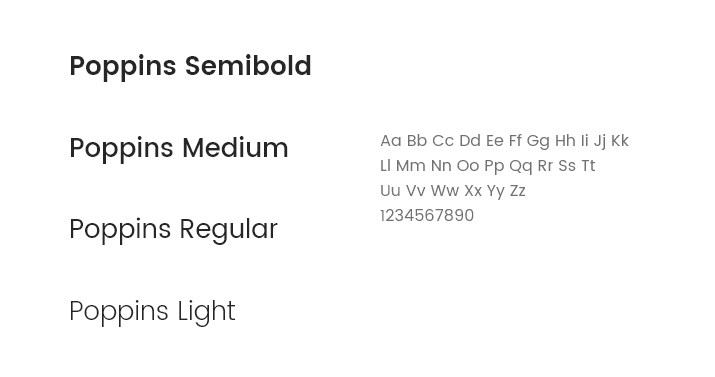
I used Poppins font family mainly. I tried to use the lighter weight all over the app design. I also tried to maintain typography consistency all over the design.
Testing is the part to validate whether the design concepts work or not. I was pretty short on time, but I managed to guerrilla-test the prototype on five people. I put together a test scenario, similar to the example scenario mentioned above, and observed people as they want to search their nearby restaurant to order food. The business owner helped me to run the test. I found that people liked the way foods are sorted in the app and how the ordering process works, which was great to see.
If you have a story to tell or would like to hear some of mine, you can send me a message from the button below.