Gartman Mechanical Services is a mechanical contractor that is experienced with completing the services needed by customers in areas of process manufacturing, HVAC services, refrigeration, and plumbing. Gartman Mechanical is an established business located in Oshkosh, Wisconsin that offers commercial and residential services such as HVAC, Heating, Plumbing, Refrigeration, as well as professional engineering services.
- Tell the brand’s story alongside the services
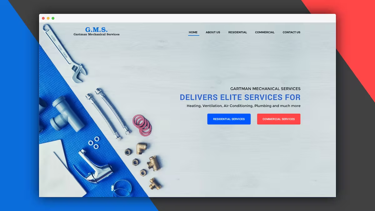
- Landing page needs to appeal to both homeowners that need residential services as well as business and industry.
- Showcase two types of services separately
- Immerse the user into the ethos of the services
- Overall needs to be user friendly and clearly show variety of services where any kind of customer can get their desired service right away
- Since they are two different target markets completely, the website needed to work for both types of audience
Commercial: Men purchasing products and managing projects for their employer such as new construction HVAC and plumbing, planning and installation and also professional engineering services. Residential: Women calling for service on home furnaces, air conditioners, water heaters and plumbing.
Web Only
http://www.totalmechanical.com http://www.oshkoshheatingandair.com
3 Weeks
- Research
- Synthesizing research & competitor analysis
- Paper prototyping
- Layout design
- Visual Design
- User Testing & conclusion
For my research plan, I needed to learn more about the market, users, their needs and company owner goals. Building a landing page for two types of users at the same time posed another challenge. First I had to reach out to the business owner to know what he actually wants to acquire through the updated website. To go more in-depth I came to learn about its targeted audience & whats their online behavior.
I synthesized the data I gathered from the study about the audiences & the goals of the business owner. Two different kinds of the audience have a separate use case. I tried to find out a better perspective of their problems and a clear solution for both type audiences under the same roof. I also found what their common requirements and how this can be solved on the first page.I also collected data from the competitor or reference website the business owner mentioned. Two websites are beautiful. But they lack in facilitating the user with their desired service. So, I have to be super careful about it & keep it in the simple interface too.
I used the paper prototype test technique because it's the easiest, fastest, cheapest method to test a digital product and it's very easy to iterate any number of times. I tried to drew the layout of the landing page based on the two types of audiences requirements & business owner and then also collected their feedback.

After the paper prototype, it is time to go digital & get a more clear vision about the UI. I took the feedback from the paper prototype & I modified the design in medium fidelity wireframe accordingly.

From all the feedback & Synthesizing its time for final visual design. It can also be called high fidelity design.
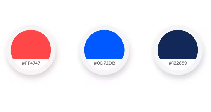
For the color scheme, I tried to keep it colorful & industry standard. I made a composition of warm & cool color, where Red is a warm color which represents excitement and blue represents dependability.


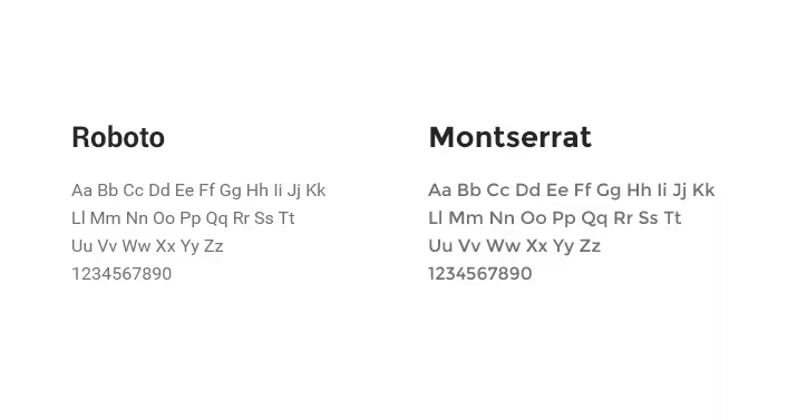
I used Montserrat & Roboto fonts mainly. I used different font weights for both of them where it's needed. I also tried to maintain typography consistency all over the design.
A landing page is an important place in the user journey that determines the perception of and feeling about a brand. The color schemes & typography should be decided straight from the landing page and would be constant across other pages.

The landing page design was appreciated by business owner & is currently being developed to be tested. Additional pages design is in progress.
If you have a story to tell or would like to hear some of mine, you can send me a message from the button below.